After some changes and re-positioning the icons in Illustrator, the artwork turned much interesting and bold in order as easier to identify the details. The progress were just changes of background color, re-positioned images and the layout orientation were changed.
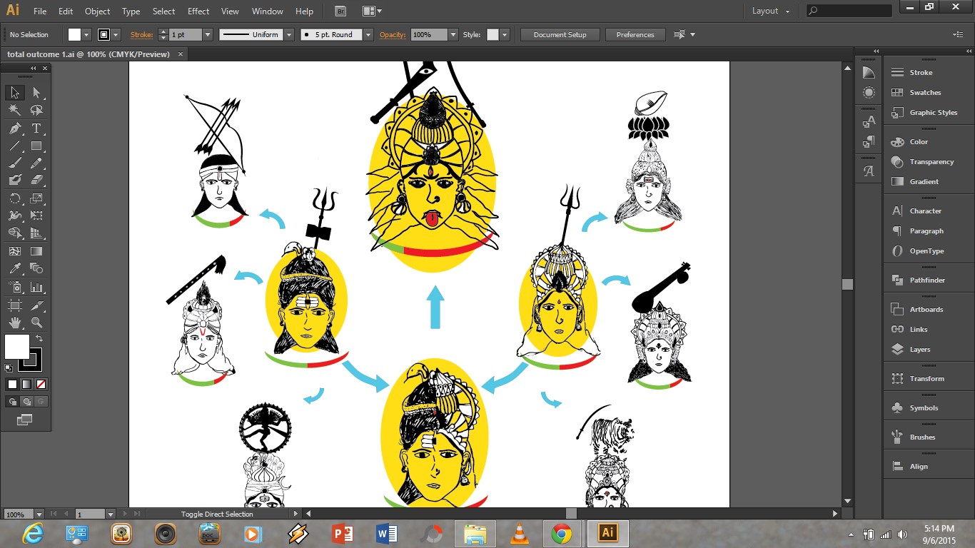

My final Artwork of this task is this:

All the inspection and changes on make it better was with the assist and guidance from our module leader. All the critics and feedback were very helpful for me to understand my weakness in producing an Infographic Poster.
At the end of this task, what i learnt here is how to transform data or numerical details to a better form of work so that it can much easier for the audience to understand the content. Other than that, this visual communication method involves attractiveness more than just numerical in a chart or table. The involvement of colour are also a matter of attraction.
No comments:
Post a Comment