Showing posts with label Colour and Design in 2 and 3 Dimensions. Show all posts

Wednesday, November 4, 2015

Colour and Design in 2 and 3 Dimensions

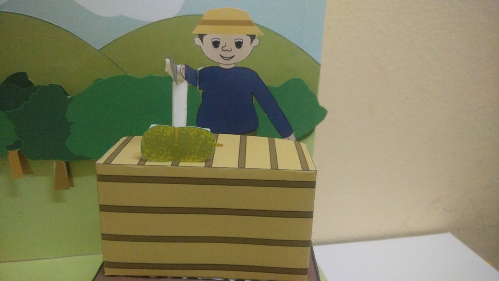
Emotion Box : physical diorama/ Mantin Mapping (3D project)


Emotion box is a project to show focused emotion of human. For this task, a mixed media art is required to designed to explore type of materials to create unique pieces of assemblage box art that are inspired. Additionally, color are also to be strongly focused.


According to my topic for this whole semester which is the Dusoon (orchard) in Mantin, a system under plantation in Mantin. My background of the emotion box is planned to be an orchard environment that is full of green trees. The trees are attached layer by layer. Other than just trees, blue sky and some simple 2D birds made of lines are attached. Then, the character of my topic is called Ah Soon, a Chinese that plays a role as an orchard keeper. My character will be represented in the emotion box as an Automata.


All the details of trees and character is printed on a white sheet with colours then glued as planned to make a 3D emotion diorama.


Sunday, October 4, 2015

Colour and Design in 2 and 3 Dimensions

Monochrome

Monochrome is a phrase often associated with older computer system monitors. Monitors, for example, can be monochrome, gray scale or color. Monochrome monitors actually use two colors, one for the display image (the foreground) and one for the background.
Graphic and digital images can also be monochrome, gray scale, or color. In photography a monochromatic image is usually in the form of a black and white photograph, which can be produced using black and white film or by removing colors in post-production.


For this task, we are required to use the photos of Mantin taken during the trip to be picked and arranged in the monochrome order. This is the process of my monochrome process (screen shots):

screen shot 1
screenshot 1 is the process of selecting a suitable colored photo for the outcome


screen shot 2
screenshot 2 is making a shape to be clip masked on the colour.

screen shot 3
after finishing monochrome, this is the monochrome colour for orange.


In this task, i have learnt how colours work layer by layer and according to the colours and the quality of shade in it.This will allow me to be able in differentiating the colour quality and the depth of the colour itself.

jpeg file of my monochrome for orange:


Saturday, October 3, 2015

Colour and Design in 2 and 3 Dimensions

What is colour spectrum?


Although light can appear white, it is actually made up of lots of different colours when all added together. The amount of each colour is called the spectrum of the light. We can see all the different colours using a prism like the one in the picture, which uses refraction (the bending of light) to split the light up. This works because different colours are bent by different amounts and so they come out of the prism in slightly different directions.

Astronomers often want to know exactly what colours there are coming from a particular star or galaxy. They use special instruments called spectrographs. Some of the light from stars can be absorbed (taken away) by atoms and molecules that get in the light's way. When this happens, narrow lines can appear in the star's spectrum. The spectrum of our own Sun has hundreds of absorption lines at different colours, all due to atoms in the Sun's atmosphere. 

As humans, our color vision influences everything from our art and poetry to the colors we paint our homes and the clothing we choose to buy. Yet, we rarely question the mechanics of our color perception – or what we may not be able to see.

How do we perceive color?

We perceive color when the different wavelengths composing white light are selectively interfered with by matter (absorbed, reflected, refracted, scattered, or diffracted) on their way to our eyes, or when a non- white distribution of light has been emitted. Visible light is merely a small part of the full electromagnetic spectrum, which extends from cosmic rays at the highest energies down through the middle range (gamma rays, X- rays, the ultraviolet, the visible, the infrared, and radio waves) all the way to induction- heating and electric-power-transmission frequencies at the lowest energies. Note that this is the energy per quantum (photon if in the visible range) but not the total energy; the latter is a function of the intensity in a beam. The visible light that humans perceive is a tiny fraction of the full electromagnetic spectrum.

We can detect the range of light spectrum from about 400 nanometers (violet) to about 700 nanometers (red). We perceive this range of light wavelengths as a smoothly varying rainbow of colors, otherwise known as the visual spectrum.

What I understand about colour spectrum is the colours that unites depending on other ray of light that comes from several different angles. Witnessing a single colour doesn’t guarantee the colour of what we see. Colour(s) form of different colour in a certain place or element.


Reference :

(2014). Microconsciousness: what is colour? [Online] Available at: http://www.webexhibits.org/causesofcolor/mind.html [Accessed on 1 August 2015].


(2015). National school’s observatory: spectrum: colours of light. [Online] Available at: www.schoolsobservatory.org.uk/astro/stars/spectrum  [Accessed on 1 August 2015].


Thursday, October 1, 2015

Colour and Design in 2 and 3 Dimension

In class activity.

This is an activity about collage that helps us to understand about monochrome more in depth. Thus, all were asked to bring and all articles, newspaper, magazine and etc. to cut all the coloured part of the book and paste it on a A3 sheet. This activity is for the colour (contrast and brightness value) understanding. Below is the Monochrome collage artwork.

below is the finished work of monochrome collage.


monochrome collage


For the background, i used comic pages to make the Yellow colour to be highlighted, and as the monochrome means, the colour that is mostly in the computer during early age of computer were built.

Wednesday, September 30, 2015

Colour and Design in 2 and 3 Dimensions


From the trip to Mantin, we are required to selected few photos that contains colours which presenting the 7 colours of spectrum.

Select photos that contains 7 spectrum colour,Then arrange them into a simplest form according to the spectrum order.

 I have selected a group of photos for the spectrum. Then a box were created in adobe Illustrator to make clipping mask of the spectrum. All these methods were repeated for the other spectrum colours.

 work in Ai:


Red:


Orange:


yellow:


Green:


Blue:


Violet:


Purple:


This is the jpeg file of my Spectrum color:


This task of spectrum is to develop skills in analysing the exact colour of a spectrum. Spectrum is a ray reflection when it hits the water. Other than that, this task helped me to understand the importance of colour spectrum.


Colour and Design in 2 and 3 Dimensions

Task 1
Light and Color
Light is a type of electromagnetic radiation. Electromagnetic radiation is made up of waves that transport energy. This energy travels in tiny packets known as photons. There are many different types of electromagnetic radiation, and together they make up the electromagnetic spectrum, which includes: radio waves, microwaves, infrared waves, visible light waves, ultraviolet waves, X-rays, and gamma rays. Waves can be measured by their wavelength (the size of the wave) and frequency (how many waves pass a point during a time interval). All of the energy inside a photon has its own wavelength and frequency.  
….photons of visible light (light that humans can see) have wavelengths of 400-700 nanometers (10-9 meter or billionths of a meter), and a frequency of 430-750 trillion (1012) cycles per second….
….The light from the sun contains millions of photons of variable wavelength, not all of which are visible to humans. Within the range of wavelengths that make up visible light, different wavelengths correspond to different colors. The light seen from the sun appears white, as it contains all wavelengths and thus all colors. (Imagine a prism breaking white light into the colors of the rainbow.) When photons hit an object, they may be absorbed, transmitted or reflected. An object appears a certain color when all other wavelengths are absorbed except the color being seen, which is reflected. For instance, plants appear green, as they contain chlorophyll, which absorbs red and blue light and reflects green light. Objects that appear white reflect all wavelengths, while objects that appear black absorb all wavelengths…
(Professor/Scientist of How Stuff Works.co, Australia)


All type of light is not same, they have different value of contrast and brightness
There is a variety in the color makeup of light that appears white. Sunlight is almost perfectly balanced light source—it contains all colors in nearly equal quantities. But daylight does experience color shifts. The color appearance of objects changes dramatically in early morning or in the shade. Electric light sources can also exhibit variations in color makeup. Incandescent lamps tend to produce more red and yellow light than green and blue, and appear to be “warm” in color. Because of the way incandescent light is produced, little can be done to manipulate its color characteristics. With fluorescent and high intensity discharge lighting, this latest technology makes it possible to manipulate the color makeup of a given light source.


Picture 1: image of a cartoon figure under a spot light

Picture 2: image of the cartoon figure under fluorescent light


Picture 3: image of the same cartoon figure under sunlight

 The difference between this two images is the quality of the sharpness of the color. As in the picture 1, the photo seems to bring up a thick contrast point on the subject matter. This is because the direct light (spot light [LED]). Moving to the other picture (picture 2), this photo is good in color for the subject matter. The problem is, it does not have any saturation quality on the subject matter. Besides, the yellow color of the object looks dull. This two results are totally different when the photograph is taken under a sunlight. As we see in the picture 3, direct sunlight shows and highlights the originality of the color on subject matter.

White Light and Bright Colors
Generally speaking, whiter light (comprised of equal amounts of all colors) makes colors appear more natural and vibrant. However, some portions of the spectrum are more important to a light’s color makeup than others. Red, blue and green—the primary colors of light—can be combined to create almost any other color. This suggests that a light source containing balanced quantities of red, blue and green light can provide excellent color appearance even if this light source is deficient in other colors in the spectrum.

Conclusion
In a process of documentation or photographing an object, the image quality in point of contrast, brightness, saturation level of color and the levels of each color angle is depend on the type of light where the photo session is taken place. This is because, not all the object is suitable for all type of lighting especially fruits in high rated color. Besides, the wavelength of all light is not balanced as wanted to imaging an object.


Reference:


Osram sylvania : Relationship between color and light. [Online] Available at: https://www.sylvania.com/en-us/innovation/education/light-and-color/Pages/relationships-between-color-and-light.aspx [Accessed on 1 August 2015].

(2011) Photo composition articles: photographic lightning. [Online] Available at: http://photoinf.com/General/NAVY/Basic_lighting_techniques-_Outdoor_and_Existing_ligt_photography.htm [Accessed on 1 August 2015].


Picture 1, 2 & 3 :
Images from mobile phone

Thursday, September 10, 2015

Visit Art Expo expo observation images

Art Expo

A trip to Art Expo KL were organised by the school to allow the student to learn many thing and to generate more ideas from what and hoe they observe all the artwork in the expo.

These are the photos taken during the visit to the art expo (expo observation images 1-8):

expo observation images 1

expo observation images 2

expo observation images  3

expo observation images 4

expo observation images  5

expo observation images 6

expo observation images 7

expo observation images 9

reflection of this task:

From this trip to KL Art Expo, i have learnt on how to display the artwork in  a proper way neatly and by setting the environment to fit the art work as well. Other than, it helped me on determining the techniques and the medium that have been used to create all the artwork. It has been an opportunity for me to develop skills and use them into the module during working on to produce a quality and creative work.


Wednesday, August 5, 2015

Mantin


Journey to Mantin

A visit to Mantin town were organised by SOMAD for the design students. Here, we are required to document, photograph, record, or sketch what we found in Mantin. The place which is focused is from the Caltex to the Hakka Village of Mantin.

The first place we started to see colours is the Wet Market, there were so many things such as vegetables, fishes, meat, anchovies and other kitchen needs. The market are also seems to be a busy place in the town of Mantin.

picture 1


picture 2

picture 3


 In this journey of documentation, I've found so many interesting things in Mantin even when i stayed here for more than 20 years. The transportation system in Mantin is very safe and it has a perfect perspective when observed from a certain angle. The reason why it is said so is because the long straight road in the town gives a central point at the end of the road lines when it is imaged.


picture 4

This is a picture of the road in Mantin which has perspective value in it. The perspective lines for the road in this picture is the road line in the picture. Other than all this, Mantin has textures and and colours that is attractive. This is because the different colour of the architecture and the different shape of it. For the texture part, a single wall can give an extra ordinary texture that can be used to be a background for a photography session.

Moving to the architecture part of Mantin, the are lots of shops in the town. There are architecture that is built according to culture and most of them are since the early 1930's and some even older than that.

picture 5

Reflection :
 From this task of documentation about Mantin, I learnt about Mantin more in the angle of texture, architecture, colours, roads, transportation and the system of why it can be called as a town. Mantin is a wonderful small town that can speak lots of story when discovered. I have not satisfied in imaging the town as i will continue snapping more about Mantin.


*All the picture were taken by mobile phone