Web analysis
Introduction
A website is a platform where so
many things are targeted to reach the audience. Besides, creativity in
designing a web page is a part of a designer’s responsibilities to attract
audiences well. The principles of multimedia design are white space, balance,
visual weight and perspective, colours, movement, 2/3:1/3 rule, simplicity and
consistency. In this case, analysing a webpage is essential according to the
multimedia principles. Multimedia design principle is a guideline for designing
a website and a tool to measure the effective of a website design.
Task (1)
By
using the multimedia design principles, a requirement of 4 websites to be
analysed thoroughly for more understanding on ways to design the website layout.
Each analysation need elaboration according to the critic/ analysation stated. Objective
of this task is to introduce and to create massive understanding on how to
analyse a website/webpage.
First
website
Screenshots
of the website:
Analysis
screen capture 1 and 2 comparison
This
is a website of electronic devices from the brand called Mi. This website is to promote and introduce new devices by the
company. Moving on to the design analysation, on this webpage, there are movement
and flow/transition images of new products of its company (as shown on the
picture above). The movement for this webpage is to introduce new devices
especially mobile phones and power bank. Other than that, the transition avoids
boredom by looking at the same images. Furthermore, this is for attraction too.
This is due to the human psychology on moving things, where we are easily
attracted to object and colours when it is transited or moved.
screen capture 3
Moving
to the next point, white space on this page are balanced. The white space on
the page is very clear for the composition and the images from this webpage
have equal space. This avoids the
audience to be confused of what they really looking at. This webpage has equal
white space too. This is due the accurate size of images and the distance of
each object in the page. This provides eye relief because all the images and
text are mixed up and not in narrow order.
screen capture 4
At the bottom right of this webpage, it has a part left
over and just an empty space. This causes the imbalance of the website’s
composition. This is under the balance principles of marketing. This part
should be filled with any images regarding the devices or any link to more
devices. Due to this, the webpage doesn’t has a screen harmony.
Opinion/ Suggestion
This webpage should be repaired so that it provides
harmony to the audience. Few other important images/ text, link resized might
be useful at the space on the right bottom of the page. It will create a
balanced footer for the page and distinguish the visual imbalance.
Second website
Screenshots of the website:
Analysis
screen capture 5
screen capture 6
This Nike website is a page of a
brand, where its intention to introduce and promote new stuffs of its company.
My analysis on this page is about the simplicity. The reason for simplicity on
this webpage is because the cleanliness of the webpage which is not full of
images. The screenshot above is the header of the webpage and the important
materials are shown at the top. The reason of this is because, the latest
design of the shoes are the first, big and highlighted image in the website.
Other than that, not too much information in the webpage. Unlimited text or information
would make the space full of distraction.
screen capture 7
Moving to my next analysation, this
webpage seems to have visual weight in it. This is because, the typo at the top
right of the site has the illusion of physical weight so that it can be seen
first and the rest after. So, the smaller fonts are important but least
important than the bold and big text. The text ‘So fast, it has its own launch pad’ is the technic to describe
about the product by not directly describing about it. This is a strategy to
influence the audience to read the small typo (text).
Opinion/
Suggestion
This
website is designed in a proper way, this is because the minimal text and
visual communications are more in this site. This will avoid the audience feel
lazy and jump on to another site which is more interesting. White background to
ensure the audience are able to differentiate the colour from the image
visualised.
Third
Website
Screenshots of the website:
Analysis
screen capture 9 and 10
This
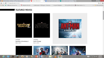
Marvel website is a site where all the entertainment programs under Marvel Entertainment
Industry. The layout of the website is very clear and understandable because of
the white space between the images in the site. Even though the pictures in the
site is not similar in colour, the ability on focusing never create a
disharmony. Moving onto another is the consistency of the site. Each page of
this site are not composed by following the theme. Marvel’s theme is red and the
suitable colour to match with it is blue, but the background colour on the
featured movies site are fully white. This effect the concentration and would
cause confusion to the audience. Confusion such as question in mind either they
are looking at the same webpage or different for those who newly introducing to
Marvel. The reason for this is, Marvel movies are usually watched by all group
of ages. In that case, when children view this with the parental guidance, they
will start think that why is the background are not same as the previous one.
screen capture 11
On
this website, the balance of composition are well planned. This shows that
circle in the screenshot above, is an enlarged image to ensure that no
remaining empty space that might bring imbalance to the site. The harmony of
the site would be affected when the upper part has more space compared with the
below part.
screen capture 12
Visual
weight for this website composition is very good. According to the visual
weight principle, the typo ‘ANT-MAN’ at the page were given in a perfect font
size to ensure that not only the icon/ character are can be seen without any
description. Moreover, the typo were given big and the other typo in small
font. This is regarding the Marvel character shown in the site are connected to
the typo.
Opinion/
Suggestion
This website should have
consideration on the consistency principle of multimedia design. This is to
ensure that never bring confusion to the viewers and to make all the page in
the site harmony in colour. In short, the website should go on the flow with
the theme colour of the Marvel or should pick colour according Genre of the
specific entertainment programs.
Fourth
Website
Website : www.lenovo.com/my/en/
Screenshots
of the website:
Analysis
screen capture 13
For
this composition of the Lenovo website is very good on the white space use. The
negative space in this site very clearly shows the distance, the subject and
the images of the products. This will cause a peaceful mind even though when it
is looked over several times.
screen capture 14
Cons
on this site is the imbalance of the visualised images. The product of four
should be divided two in a row to create harmony in the display of product.
Besides, this highlight the empty space of the site. Moreover, the page shows
imbalance on the right side too. This is because the text link on the left side
of the page. This causes more visual weight on left side of the page and only
one part is focused more compared with right side.
screen capture 15
Other
than that for this webpage, the background colour selection are not a good
idea. The reason for this is because, the colour selected contains high
contrast. Viewers who sees the page more than 5-8 seconds might have headaches
due to the colour. This would cause the viewers to dislike the page and
straight away they jump into different website. This two colours are not a
soothing colour to be visualised.
Opinion/
Suggestion
The
typeface for this website is very dull, it should be highlight the devices
according to a specific device with the minimal use of word and colour. Other
than that, for excitement instead, the least use of the colour might be more
helpful rather than filling a part fully with colours.
Conclusion
Analysing a website is to evaluate
matters and basic consideration before designing our own. This is to avoid
designing a boring, bad or complicated page. A successful page are efficiently
done according to the multimedia design principles. Design principles are tools
that to drag the designer according to what is important in building a website
and a guideline on how to evaluate a good or bad site. Analysing website is an
experimentation process before beginning the composition process. Analysing a
website are easier since understanding the multimedia design principles.


