Choose a web page, then analyse and describe about it.
The web page that I have selected to analyse for this task is the English Premier League's official webpage.
Link : http://www.premierleague.com/en-gb.html#
This is how the web site look like :
 |
| screenshot 1 |
These are my analysis:

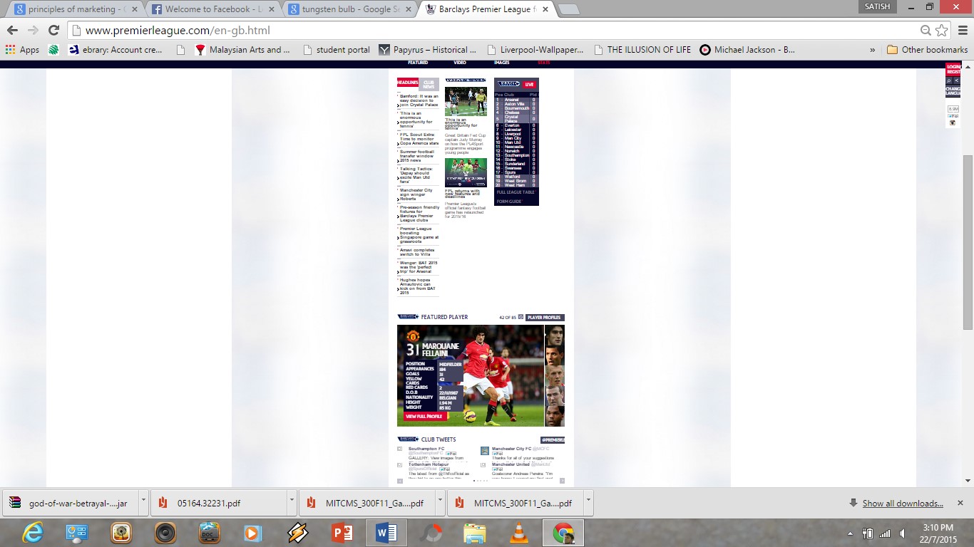
screenshot 2
This page has the header and the footer which the colour of both header and footer are in Blue Black. The reason why blue is selected is because of it is the theme colour of English Premier League. Only the header and footer part were given such a colour, the body is just a White coloured space, so that the text are readable for the viewers. Moreover, at the header part, images keeps rotating on the display part to avoid boredom.

screenshot 3

screenshot 4
The bottom part of this has more links about football which is connected to the EPL matches. Besides, the font used are big and clear. The text colour are in white since the footer background is dark. Adding on it, the are membership link provided at the right side of the webpage.

screenshot 5

screenshot 6
screenshot 7

screenshot 8
The page layout is divided into three on the body part of the webpage. Left part of the webpage is listed with headlines. The center part is full of news links with images and the following right part is a table of the EPL teams and their points achieved in the league. This page has least 'white space' on it but still it doesn seems to be much messy due to the planned layout and the way how interactive it is. The pages maintains consistency in colour, this is because the following pages of this website page are just same as the home page. Links are divided and direct to new page when it is click on so that the viewer doesn't have to see only text all the time.
To ensure that the text are clear in visual, the Arial typeface is selected in this webpage. In certain part, bold and bigger font were given to form text hierarchy.
After knowing the principles of multimedia, basic analysis on a webpage is easier for me go through. This webpage uses text and images equally on the layout. During my exploration of this website, I had never feel confused of the contents. Overall, this is a good and well planned website.
No comments:
Post a Comment