Tuesday, August 19, 2014

Critical Thinking

Task 2 : 

Word As Visual Expression

We are require to discuss in the class to know our own characteristics. A person should have 10 characteristics which are given by classmates. Those ten characteristics that given for me  are :


1. playful
ˈpleɪfʊl,-f(ə)l/

definition :
fond of games and amusement; light-hearted.


2. active
ˈaktɪv/
definition :
engaging or ready to engage in physically energetic pursuits.


3. helpful
ˈhɛlpfʊl,-f(ə)l/

definition :
giving or ready to give help.


4. ambitious
amˈbɪʃəs/
definition :
having or showing a strong desire and determination to succeed.


5. hard work
/hɑːd/ /wəːk/

definition :
a great deal of effort or endurance.


Mind map of these characteristics helped me to look further on links that related to the characteristics and to elaborate those characters according to my own understanding.


Characteristic that we can find in ourselves can be expressed through different type of fonts, design, color and features. Each characteristic can be designed by experimenting it in design terms. Playing with fonts and design of letters are helpful in many ways,for an example in creating a cartoon character, besides it makes visual communication to be much interesting.

20th Design Century

Task 2


DADA
Dada was, officially, not a movement, its artists not artists and its art not art. That sounds easy enough, doesn't it? Of course, there is a bit more to the story of Dadaism than this simplistic explanation.
Dada was a literary and artistic movement born in Europe at a time when the horror of World War I was being played out in what amounted to citizens' front yards. Due to the war, a number of artists, writers and intellectuals -- notably of French and German nationality -- found themselves congregating in the refuge that Zurich (in neutral Switzerland) offered. Far from merely feeling relief at their respective escapes, this bunch was pretty ticked off that modern European society would allow the war to have happened. They were so angry, in fact, that they undertook the time-honored artistic tradition of protesting.
Banding together in a loosely-knit group, these writers and artists used any public forum they could find to (metaphorically) spit on nationalism, rationalism, materialism and any other -ism which they felt had contributed to a senseless war. In other words, the Dadaists were fed up. If society is going in this direction, they said, we'll have no part of it or its traditions. Including... no, wait!... especially artistic traditions. We, who are non-artists, will create non-art -- since art (and everything else in the world) has no meaning, anyway.
About the only thing these non-artists all had in common were their ideals. They even had a hard time agreeing on a name for their project. "Dada" - which some say means "hobby horse" in French and others feel is just baby talk -- was the catch-phrase that made the least amount of sense, so "Dada" it was.
Using an early form of Shock Art, the Dadaists thrust mild obscenities, scatological humor, visual puns and everyday objects (renamed as "art") into the public eye. Marcel Duchamp performed the most notable outrages by painting a mustache on a copy of the Mona Lisa (and scribbling an obscenity beneath) and proudly displaying his sculpture entitled Fountain (which was actually a urinal, sans plumbing, to which he added a fake signature).
The public, of course, was revulsed -- which the Dadaists found wildly encouraging. Enthusiasm being contagious, the (non)movement spread from Zurich to other parts of Europe and New York City. And just as mainstream artists were giving it serious consideration, in the early 1920s, Dada (true to form) dissolved itself.
In an interesting twist, this art of protest -- based on a serious underlying principle -- is delightful. The nonsense factor rings true. Dada art is whimsical, colorful, wittily sarcastic and, at times, downright silly. If one wasn't aware that there was, indeed, a rationale behind Dadaism, it would be fun to speculate as to just what these gentlemen were "on" when they created these pieces.
Key Characteristics of Dada Art
  • Dada began in Zurich and became an international movement. Or non-movement, as it were.
  • Dada had only one rule: Never follow any known rules.
  • Dada was intended to provoke an emotional reaction from the viewer (typically shock or outrage). If its art failed to offend traditionalists, Dada writing -- particularly Tristan Tzara's manifestoes -- proved a fine, nose-thumbing Plan B.
  • Dada art is nonsensical to the point of whimsy. Almost all of the people who created it were ferociously serious, though.
  • Abstraction and Expressionism were the main influences on Dada, followed by Cubism and, to a lesser extent, Futurism.
  • There was no predominant medium in Dadaist art. All things from geometric tapestries to glass to plaster and wooden reliefs were fair game. It's worth noting, though, that assemblagecollagephotomontage and the use of ready made objects all gained wide acceptance due to their use in Dada art.
  • For something that supposedly meant nothing, Dada certainly created a lot of offshoots. In addition to spawning numerous literary journals, Dada influenced many concurrent trends in the visual arts (especially in the case of Constructivism). The best-known movement Dada was directly responsible for is Surrealism.
  • Dada self-destructed when it was in danger of becoming "acceptable".
one of the most famous dada arttist :

 Abstract Painting of Marcel Duchamp, 1918, Museum of Modern Art, New York


Marcel Duchamp,  was born on July 28th, 1887, near Blainville, France.


Marcel Duchamp is one of the most popular dada artist who exist in the early age of dada when it was found. Most of his arts are successful arts which had reflected positively to the society in France.


Reference:

Shelley, E. (2013) About.com art history. [Online] Available from: http://arthistory.about.com/cs/arthistory10one/a/dada.htm [Accessed 1 August 2014]


Reflection

My understanding and reflect on Dadaisme is:
  • an era of design 
  • an unconscious design
  • it is nihilistic
  • it has no rules
  • its a artistic  movement of imaginary
  • around the year 1916
  • some take it as positive some on the opposite (in certain countries)

Dadaisme does not have a specific topic to/in/for design, its unpredictable, can't be judged, its abstract sometimes or sometimes not at all and etc. Its more on expressing emotions and life situation on what we had gone through and on what we are going through. It is influential artistic movement. What i see in Dada is how people show importance on each and every single issues in our surrounding environment and developing ideas trough imaginations and predictive messages in certain situation. 

Tuesday, August 12, 2014

Methods Of Investigation


Instruction :  

You are required to select 10 books which is relating to architecture. 
(Architecture : Modern, Home, Design and etc.)

Art of Product Design : Changing the Way Companies That Make Things Work  
Author : Meybaum, Hardi   
Publisher : John Wiley & Sons,  Incorporated
Date published :  02/2014

Designing Rainwater Harvesting Systems : Integrating Rainwater into Building Systems   
Author :Novak, Celeste Allen   Geisen, Eddie Van   DeBusk, Kathy M.   
Publisher :John Wiley & Sons, Incorporated
Date published :02/2014 

Contagious Architecture : Computation, Aesthetics and Space   
Author :Parisi, Luciana   
Publisher : MIT
Date published :03/2013 

Pursuit of Pleasure   
Author : Rendell, Jane   
Publisher : Continuum International Publishing
Date published :07/2010 

Women's Berlin : Building the Modern City   
Author :Stratigakos, Despina   
Publisher : University of Minnesota Press
Date published :10/2008 

Framing Places : Mediating Power in Built Form   
Author :Dovey, Kim   
 
Publisher : Routledge
Date published :04/1999 

DETAIL Engineering : Bollinger + Grohmann   
Author :Schittich, Christian   Schmal, Peter Cachalo   
Publisher :DETAIL
Date published :06/2013 

Performance-Oriented Architecture : Rethinking Architectural Design and the Built Environment   
Author :Hensel, Michael   
Publisher : John Wiley & Sons
Date published : 04/2013 

Solid States : Concrete in Transition   
Author :Bell, Buckley   Buckley, Craig   Bell, Michael   
Publisher : Princeton Architectural Press
Date published :11/2010 

Modern North : Architecture on the Frozen Edge   
Author :Decker, Julie   Princeton Architectural Press Staff   
Publisher : Princeton Architectural Press
Date published :03/2010 

Manhood Factories : YMCA Architecture and the Making of Modern Urban Culture   
Author :Lupkin, Paula   
Publisher : University of Minnesota Press
Date published :12/2009 


Tuesday, August 5, 2014

Design Studio Conceptualisation


Task 1


"mark making"
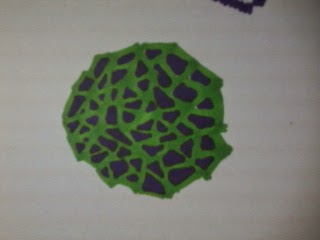
 A term used to describe the different lines, patterns, and textures we create in an artwork. It applies to any art material we use on any surface, not only paint on canvas or pencil on paper. A dot made with a pencil, a line created with a pen, a swirl painted with a brush, these are all types of mark making. 


task :
making our own texture (mark making).


After my first experience in mark making,
mark making has become an interesting activity for me and i enjoyed mixing techniques and paints on papers. Each and every textures by making marks is magnificent. There are no texture which is not acceptable.


Reflection :
In this task of mark making, i have learnt to be more creative in selecting color and making shapes. This task helped me to reveal my creativity in making marks.


Sunday, August 3, 2014

CRITICAL THINKING


Task 1 (a)


Think Hard

a). Making your own typography.


1. Art Work(typography)


Difficulties in this task was about maintaining the theme of the font so that it is consistent to see and read. In a another way to say is, its not easy to place shapes and its not easy to maintain shapes because the idea is the same but arrangement of the shapes are very important to display a good font or typo.


2. Idea generating process (sketches) :


As a reason of why i selected shapes such as rectangle and triangle is due to the basement which is totally balanced and stable. Besides, modification of shapes brought me up to an idea in making typography and its much interesting to work on shapes. In short, i believe that shapes are one of the best elements for alphabets. References for this art work is not from the internet or any other resource, it is from underage kid's toys. Toys for under age children is usually based on shapes and learning.For A-Z, its about learning so shapes helped me to form typography in such a design.


Task 1 (b)

b). Use an image by using the typo that you have done to represent yourself.


I selected a KEY for SUCCESS is because a key is a symbol of success and everybody has a key of success in their life. As me myself, i believe that hard work is the key of success,so i would go through as many as hard ways to be a successful person.  


Reflection :


Typography is one the visual communication method. In designing a font, it’s important to see the function in attraction and creativity. Designing fonts are interesting and challenging but the main is the concept in designing and maintaining the concept from A to Z. Creating font was to explore exact measurement of font which to be perfect in shape and size.


DIGITAL DESIGN

Task 1

Create a Poster about a movie that you have watched. The pster should be 12"x18" (vertical). 


TRANSFORMERS 3 : DARK OF THE MOON

Sinopsis :
Sam Witwicky and the Autobots found that Government hides some official secrets of the Dark Side of Moon. Sentinel Prime (Autobot) found in the Dark Side of Moon with some tele portal pillars. Sentinel Prime (Autobot) were brought to earth. A betray to the Autobots and The US Government by Sentinel Prime (Autobot) with deal with Megatron (Decepticon) to bring Cybertron to earth. Extinction of human increase by the rule of Decepticons. The Autobots and NEST (a group of US ARMY) fight to get back earth from Decepticons.


I have selected to make a poster of the movie Transformer 3 : DARK OF THE MOON


The reason why i have selected the movie Transformers  3 : DARK OF THE MOON is because the graphics and the perfect animation of the movie attracted me so much. Besides , the movie flow was really exciting and interesting. This movie by Michael Bay was a terrific screen play movie and its a blockbuster movie. Most of the features in this movie brings every meaning of this movie.


These are my early stage sketches :


Idea generating process:


 These are my imagination sketches of Cybertron which appears in this movie. An eye of the robot is to generalize the poster that it is about the robot but a better idea was to place the Logo Of Autobots and Decepticons instead of placing the full title (Transformers). As the slogan of the movie (DARK OF THE MOON) i have placed a dark moon to represent the dark side of the moon. This is due to the story that says there are a part of the moon which is dark and there are some mysterious robots activity is going on. All this facts of story had brought me to make such a poster.

My posters which is fully done. 
Hope to get some feedback for more corrections.


Reflection :
In making a poster, idea and the concept is important as the message as well. In this minimalized poster, the main theme of the movie selected is the important element to be displayed in the poster. In this process, I’ve learnt on how to arrange elements of images by picking suitable thumbnails for the selected movie and theme.